Do you remember the first time you saw the YouTube logo? It’s hard to forget, right? That bright red box with the white “play button”? The logo has come a long way since it was first created in 2005.
Millions of people use YouTube daily to watch videos, and many may not realize that the logo for the website is quite interesting.
The internet has changed massively over the years, and so has the YouTube logo. If you want a sneak peek into this famous logo’s history, you’ve got to the right place.
In this blog post, we’ll look at the history of the YouTube logo and how it’s evolved. We’ll also discuss the logo’s meaning and what it represents for the company.
So, let’s get started! And when you’re finished read our other YouTube guides:
- YouTube’s History | How It Started
- Youtube Comment History: How to See Your Comments on YouTube
- How to Clear YouTube History
Meaning of the YouTube Logo
Logos play a significant role in our lives. We see them every day, and they often influence our purchasing decisions. A logo is much more than just a simple image; it’s a symbol that represents a brand or company.
The YouTube icon is no different. This simple image has a lot of meaning behind it. Let’s look closely at the logo and see what it represents.
It consists of the play button and the word “YouTube.” The play button is meant to represent the idea of watching a video. It’s also a nod to the company’s roots; a video-sharing website.
The YouTube Red color represents love, passion, energy, and excitement. It’s also meant to be a symbol of courage. The word “YouTube” is written in white, representing purity and innocence. The black in the logo represents strength and power.
The logo is a simple yet powerful image representing the company’s core values. It’s also an easily recognizable logo that people will remember.
History of YouTube Logo Changes
Three PayPal employees – Chad Hurley, Steve Chen, and Jawed Karim – started YouTube in February 2005. The first video on the platform was uploaded on April 24, 2005. This was Karim’s “Me at the zoo,” which has garnered over 240 million views as of 2022.
It is safe to say it is the only video that has generated the highest number of subscriptions, as Jawed, who also served as chief executive, boasts over 3 million subscribers. From its humble beginnings, the site has undergone several logo changes. Let’s take a look at how the YouTube logo has evolved.
The First YouTube Logo 2005 – 2011
The original YouTube logo was designed by one of the co-founders, Chad Hurley. He wanted a clean and simple design that would be easy to recognize. Hurley studied Fine Art at the University of Pennsylvania, so it made sense for him to design the logo.
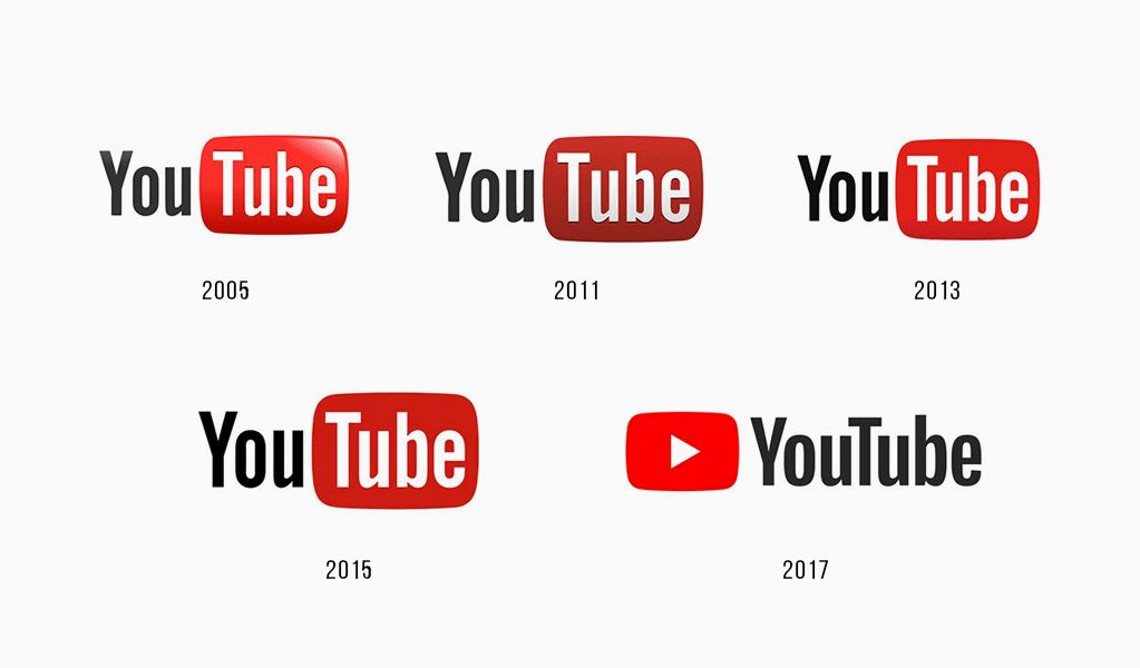
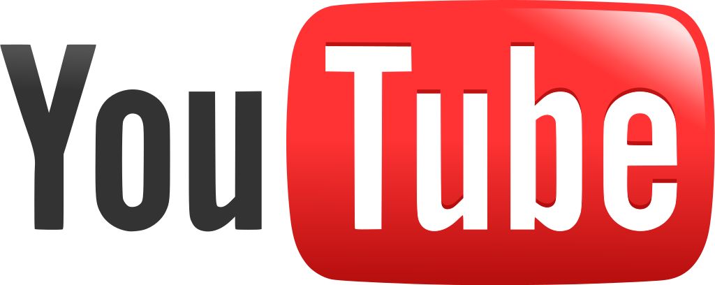
When YouTube first launched in 2005, it was a simple website with a basic logo. The word ”You” was written in black, with “Tube” in white. You can see the 3D effect on the box, giving it a realistic look. The word “Tube” was placed on top of the television to show that it was a website for watching videos.
The box has a rounded edge to give it a softer look. This was the first YouTube logo from 2005 to 2011.
2011 – 2013
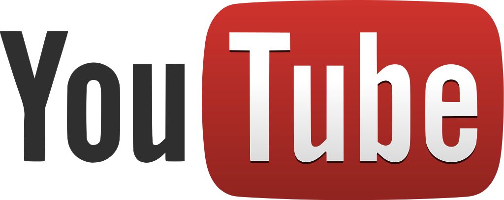
The company dropped the 3D effect in the second logo. This was when people had already started using flat-screen TV instead of a traditional tube TV. The word “You” was still written in black with “Tube” in white but now placed in a darker rectangular box. The slogan “Broadcast Yourself” was also dropped from the company’s marketing campaign. This was the YouTube logo from 2011 to 2013.
2013 – 2015
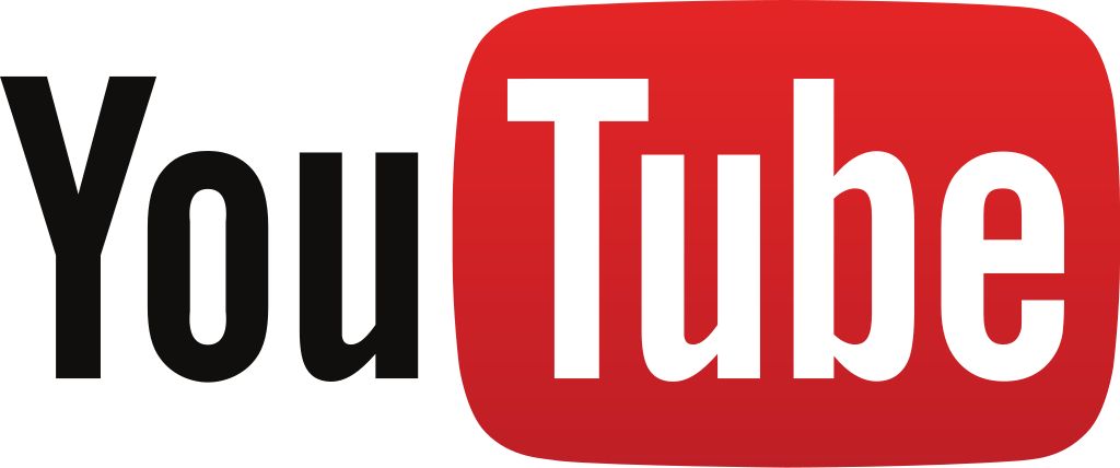
The logo at this time remained unchanged except for the color. The darker red box was again given a lighter feel but remained flat and simple. This gave it a trendy and modern look.
2015 – 2017
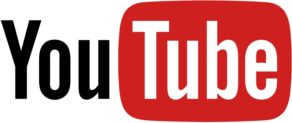
The YouTube icon got a further redesign in 2015. This time, the company needed something more serious, and corporate-looking, as businesses and media organizations were now using it. The area of concentration is again on the red box. It got a new shade, a deeper red but not as dark as the 2011 version. The word “You” was still written in black, with “Tube” in white.
2017- present

The current YouTube icon was introduced in 2017, and it’s a refreshing departure from the previous logos. The new logo 2017 – present time is a playful take on the classic ‘play button icon. The new logo is minimalistic and modern, and it’s a far cry from the busy, cluttered look of the old logos.
The 2017 logo is also more versatile than the previous logos, as it can be used on various backgrounds and color schemes. It starts off with a red play button beside the YouTube wordmark.
The wordmark is written in black, with the “Y” and “T” capitalized. This gives the logo a more balanced look, and it’s also more legible than the previous versions.
The current logo has been well-received by both users and critics, and it’s a marked improvement over the previous versions. It’s a clean, modern logo representing the evolving YouTube brand.
YouTube Logo Font

Many people have asked about the font used in the YouTube logo. According to Google, Chad Hurley made the logo using a modified Alternate Gothic. It is a sans-serif font family created by M.F. Benton in 1903. The font is available for free on Google Fonts.
What Makes YouTube Logo Different
You’d agree that a logo is a key ingredient in any company’s branding strategy. It should be simple, relevant, timeless, and easy to remember.
The YouTube logo has all of these qualities. In addition, the logo is also flexible and versatile. It can be used on a variety of backgrounds and color schemes. Let’s take a look at these features in detail:
Simplicity
Google is well-known for its simple and clean designs, and the YouTube logo is no exception. We find ourselves in a world where we’re constantly bombarded with images and videos, so a logo needs to be easy on the eyes. Brands with complex logos often have a hard time standing out.
Relevance

The YouTube logo is relevant to the company’s brand identity. It represents the core values of the company: innovation, creativity, and user-friendliness. The logo also represents the company’s mission to make video accessible to everyone.
Timelessness
The YouTube logo is timeless and will never go out of style. It’s a simple design that can be updated and tweaked as needed, but the basic shape will always remain the same. This is important for a company that wants to maintain a consistent look and feel over time.
Easy to remember

The YouTube icon is one of the most recognizable logos on the internet. The simple, red and white design is easy to remember and featured prominently on the site’s home page.
Even if you’ve never visited YouTube before, you’re likely to recognize the logo when you see it. This is a deliberate design choice on the part of YouTube’s founders.
They wanted to create a logo that was both distinctive and easy to remember so that it would stand out in users’ minds when they were searching for video content online.
And it seems to have worked – the YouTube logo is now one of the most recognizable Brands on the internet. Thanks, in part, to its simplicity.
Conclusion
The home of exclusive content, YouTube and its icon have come a long way since it was first introduced in 2005. It’s undergone several redesigns, but the basic shape and color scheme have remained the same. We hope this blog post has given you a little insight into the history of this iconic logo. Thanks for reading!
- Can You Buy YouTube Subscribers To Grow Your Channel Successfully? - March 11, 2024
- How to Use YouTube for Content Promotion? - October 12, 2023
- Does YouTube Use Artificial Intelligence? - October 10, 2023

